Thursday 13 September 2007

Wicked Taps...


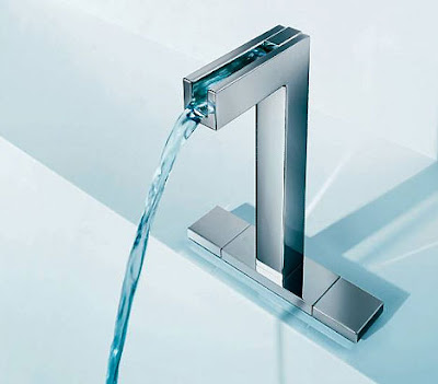
HANSAcanyon by HANSA, a German design company, has to be the coolest tap I have ever seen!!! Aesthetically, it is beautiful, functionally it's even better.

The taps incorporate LED's into the design, which indiciate the water temperature (blue = cold, purple = warm, red = hot) making them (possibly) the worlds first 'ambient' bathroom fittings!!

Wednesday 12 September 2007

Tuesday 11 September 2007

Zeeeee Scribbler!

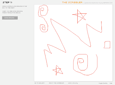
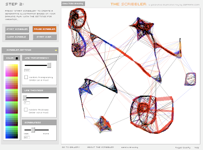
...this site is loads of fun, and you can make some really pretty pictures!!

The Scribbler!

Before...


After...

Monday 10 September 2007

Turn it on, turn it on again...

This summer, I spent a heck of a long time watching gigs/live music here there and everywhere.
But, the one performance out of the many many MANY I saw which stood out as being absolutely phenomenal was Genesis. They were outstanding.

But I'm not just talking about musical ability, the set they used this summer for the 'turn it on again' tour was like no other I'd ever seen...


I have been to many gigs that use pretty innovative sets, Placebo for example often use dramatic movement with violently dropping lighting rigs etc. but nothing quite on this scale.


It was obvious that every single track had been thought about in its own right, as the visual accompaniment for each was disticntly different and fit the themes and moods of the music perfectly.
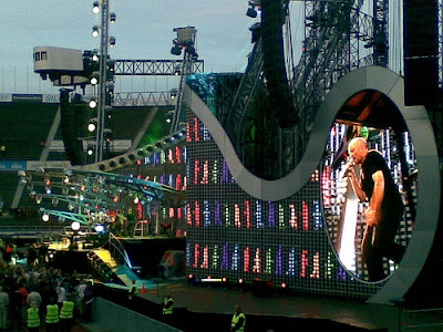

The logistics of the whole operation must have been hair-pullingly-stressfull, as often there was less than 24 hours to dismantle/relocate/assemble the whole set ready for another performance.
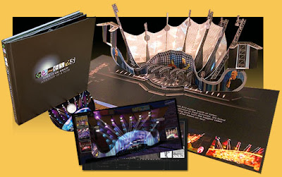

It really made me realise just how important the visual elements of a concert are to the overall effect and enjoyment, it cost a seemingly outrageous £60 a ticket to see genesis, but it turned out it was worth every penny.

Live Clip 1
Live Clip 2
Live Clip 3
Live Clip 4
Live Clip 5
Live Clip 6

Thursday 6 September 2007

Indexed

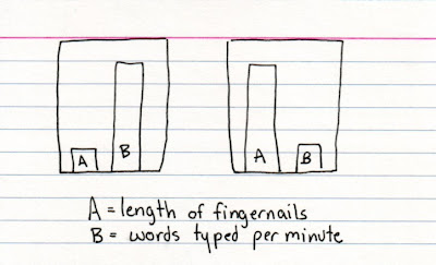
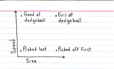
I came across Indexed (a fellow blogspot blog) while surfing today, and it made me giggle.

The graphs are SO simple, yet really effective (I suppose the whole point of a graph in the mathematical sense is to get something across simply and effectively) and they get the 'joke' across in a way everyone can understand.


I can imagine this 'graph' method being used in many circumstances, not just for light hearted humor.

Tuesday 4 September 2007

Just a quickie...

... just been watching the new Jamie Oliver series on C4, they use some really nice artwork between scenes and for the end/title credits - think they are going for the "organic" feel to fit in with the series, sort of a scrapbooky/recipe booky type thing! It makes a refreshing change to some of the really cruddy credits and faff that I see on a daily basis!!

Monday 3 September 2007

Give a few bob...

Not sure exactly how long this campaign has been running, but I think it's ace! You may have noticed the print ads in magazines/newspapers/outdoor media (bus stops etc) but I think the real winner is the TV spot (which can also be found here) featuring Bob Monkhouse, who died 4 years ago from prostate cancer. The way the ad has been put together is similar to the now famous Radio 2/VW Golf ads which feature old footage manipulated and reworked to fit a new and "impossible" situation.


I think it makes a very successful campaign, the amazing realism of it really does grab your attention (it's actually made using real clips, an actor double and a "voice soundalike") and the tag line is pretty catchy too. I hope it really does make a difference for such an important cause.

Saturday 1 September 2007

Daft Hands

Loving the Daft Hands video. Some of the responses are pretty good too, its a youtube legend.

Check it oooooooowwwtttt